Geotab · Handed off 2026
Replacing hidden beta toggles with a program people choose to join
- Team
- Product designer (me), 2 product managers, 2 developers
- Deliverables
- User journey, functional prototypes (HTML & Figma), 2 rounds of user testing, UX scorecard
- Impact
- For users: UX scorecard 2.7/5 → 4.25/5. For our product team: one way to release, test, and retire beta features.
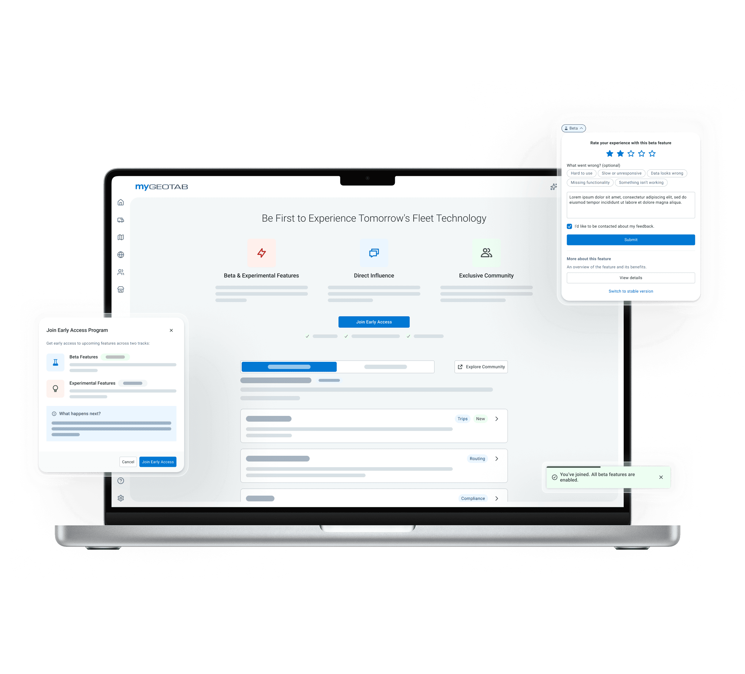
The Early Access Program: the program page and the Beta pill
/ Program page
/ Beta pill
Details blurred for NDA
01 / The problem
Some users wanted more updates. Others wanted us to stop changing things.
MyGeotab serves a broad range of fleet teams, and they don’t share the same needs, appetite for risk, or expectations of new features.
Some asked for new features as soon as possible. Others relied on a predictable tool and complained that it changed too often.
/ Unmet needs
…but the beta toggles served neither group, nor our team.
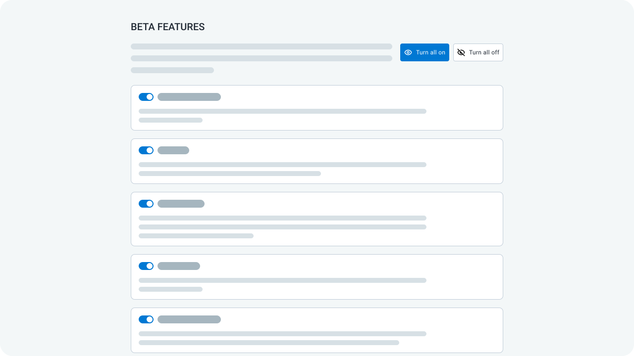
Every beta feature was its own toggle in User Options, sometimes more than 20 in one list. Finding the right one took extra steps every time.
Teams that wanted stability had to turn off betas that came on by default. Teams that wanted updates rarely found new ones in time.
Our team lost out too. Feedback started from the same toggle, so it rarely came while people used the feature.
02 / The solution
Replace feature settings with a program people choose to join.
A toggle asks, “Do you want this feature on?” A program asks, “Do you want to help shape what’s next?” Teams that want change join. Teams that need stability keep it.
I mapped the journey from first invitation to leaving, including “not now”, and built it as functional HTML and Figma prototypes.
Before
After
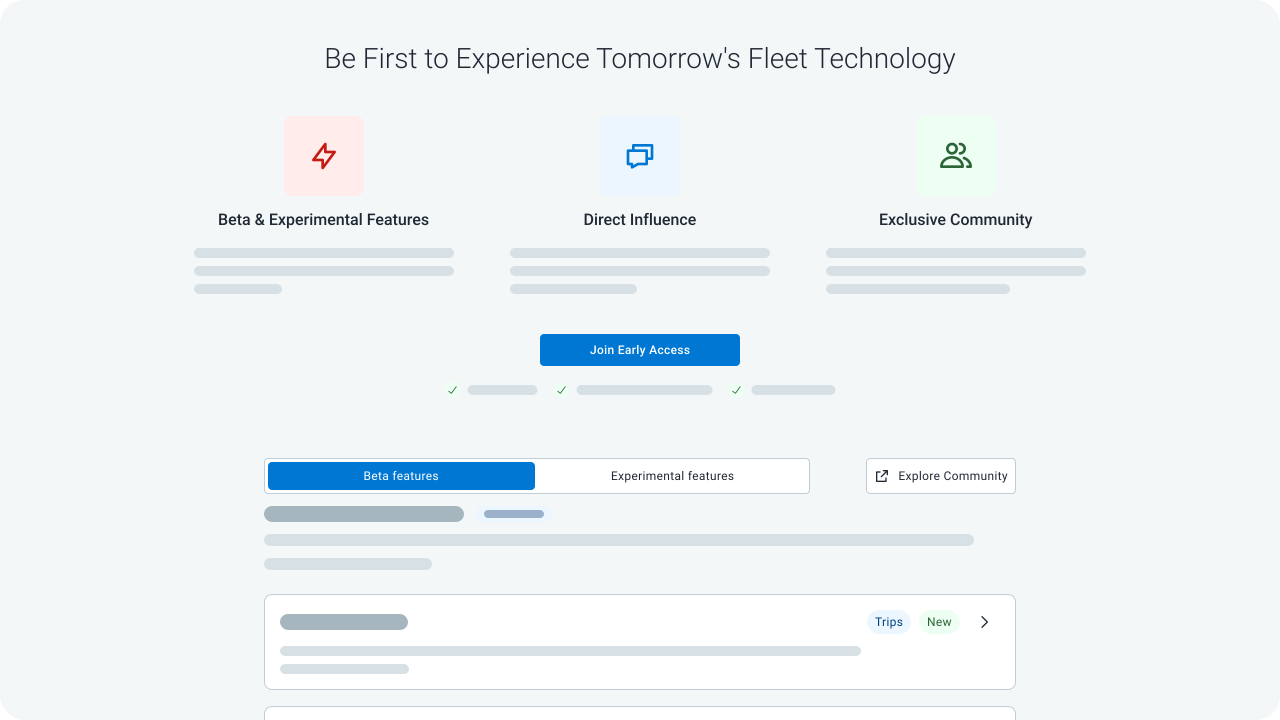
/ The solution components
Show what joining means before asking anyone to commit.
The program page leads with what members get, then splits features into beta and experimental tracks by risk. Each feature opens a panel with its benefits and a demo.
Every way in ends at the same confirmation, which says what turns on and that users can leave at any time.
Invite people where the feature lives, and let them join in one step.
The invitation moves out of User Options and onto the page a beta feature changes, like Map Layers on the Map. It reaches the people that feature affects, and they can dismiss it.
The old page made first-time users decide on every feature. Now one step turns on all beta features, the Map switches in place, and a Beta pill appears beside the page title.
Collect feedback, and offer a way back, where the feature is used.
Feedback used to start from the feature’s toggle in User Options, away from the feature itself. Now the Beta pill opens a quick rating, and a low rating asks what went wrong, so each response names one feature and one problem.
If a feature gets in the way, the same pill switches that page back to the stable version. Users stay in the program and can turn the beta back on from the pill.
Give each appetite for risk its own layer of access.
Wants stability → stays out. Nothing changes until a team joins, and leaving takes anyone back to the stable version.
Wants updates → joins. Every beta feature turns on by default. Experimental features, early prototypes with more risk, stay off.
Wants the latest → experimental features. Each one turns on separately, with a warning to test on non-critical data.
Wants full control → Program Settings. One layer down, every beta and experimental feature has its own toggle.
03 / Validation & iteration
Two rounds of unmoderated testing showed where people got lost.
Old toggles’ usage data: one decision to join held. Before the redesign, people kept most betas on and turned off only the ones in their way.
Round 1, 19 external testers: a clearer way in. Many weren’t sure they had joined, so joining now ends with a confirmation and features lead with a demo.
Round 2, ~20 internal testers: fewer surprises. Every beta turning on was unexpected, and feedback was hard to find. Now the confirmation says what turns on, and the pill opens on rating.
04 / The trade-offs
Fewer, better-matched testers over more of them.
More testers → the right audience. Joining is a deliberate step, so fewer people join. Those who do want change, so their feedback is worth acting on. Teams that need stability are left alone.
Fewer steps → an informed choice. Joining takes longer than flipping a toggle. The program page shows what members get, and the confirmation says what turns on and that they can leave anytime.
Full control first → a simpler start. One decision turns on every beta. Leadership wanted per-feature toggles first; they’re still there, one layer down.
05 / The impact
A clearer experience for users and a clearer release path for the team.
For users: UX scorecard 2.7/5 → 4.25/5. All four tasks improved, and exploring features moved the most, from D to A.
For our product team: one way to release, test, and retire betas. Every beta now goes through the same program, so teams get a group of willing testers and feedback tied to one feature.
There is no launch data yet. At handoff I set success metrics for tester engagement, feedback quality, and support tickets from unexpected changes.
06 / The takeaways
Who a feature reaches matters as much as the feature itself.
Reframe before you redesign. A better toggle wouldn’t have fixed this. Changing the question users were asked did.
Let evidence push back. Testing kept the direction but showed that controls and the way out had to be easier to find.
Name the cost of every trade-off. Friction and fewer testers were worth it only because they bought feedback a team can act on.